



Daleys Kitchen
THE CHALLENGE
Opening a hospitality venue on the Central Coast means competing in a highly saturated, sun-bleached market where modern-coastal cafes blend together. As a brand new entity, Daleys Kitchen couldn't rely on established foot traffic or legacy reputation. They needed to immediately carve out a distinct identity that would stop beachside crowds in their tracks, drive local word-of-mouth, and establish an instant sense of community nostalgia from day one.
THE STRATEGIC & CURATIVE PROCESS
Rather than defaulting to the predictable, minimal white-and-timber aesthetic typical of local coastal spots, we strategically pivoted toward a warm, retro hospitality identity:
Strategic Positioning & Rejecting Trends: We consciously rejected sleek, modern-minimalist visual trends. In a region flooded with neutral, sterile coffee shops, a vibrant 70s-inspired palette and nostalgic typography created instant visual separation and emotional warmth.
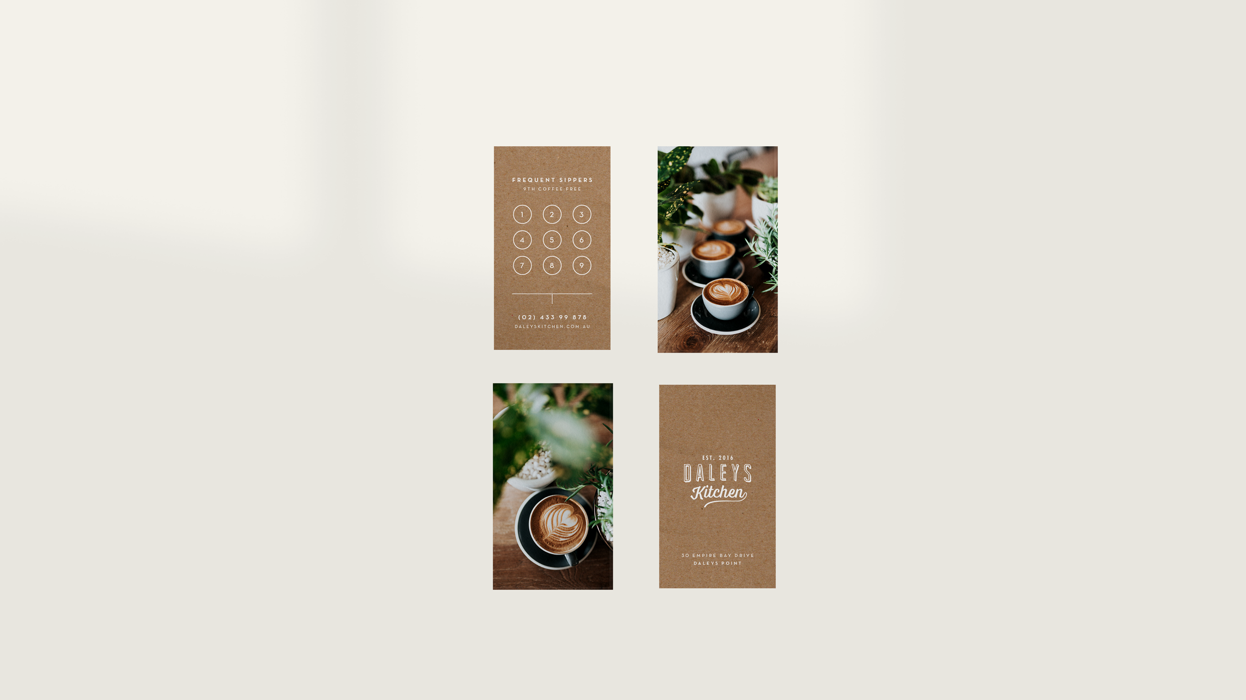
Curation of Touchpoints: The retro concept wasn't just a logo; it was a physical atmosphere. I curated and designed the entire touchpoint ecosystem—from high-impact street-facing signage and printed menus to custom apparel, takeaway packaging, and merch. Every item was designed to be inherently shareable on social media by patrons.
Production & Materiality: To ensure the retro vibe felt authentic rather than gimmicky, we selected tactile print finishes, rich screen-printing inks, and warm paper stocks that felt established, lived-in, and welcoming.
THE Impact
Daleys Kitchen launched with an unmistakable brand presence that immediately set them apart on the Coast. The distinctive visual identity gave the new venue an instant personality, transforming a fresh launch into a recognizable local landmark that captured both daily beachgoers and destination coffee seekers.