




Eunoia
THE CHALLENGE
The boutique wellness and yoga space is filled with predictable visual tropes, making it difficult for new studios to stand out. Designed as an exploratory visual identity study for a modern coastal studio, the objective of Eunoia was to take the most iconic symbol of yoga, the lotus flower, and strip away the clutter to build an identity anchored entirely in tranquility, balance, and intentional restraint.
THE STRATEGIC & CURATIVE PROCESS
Every visual decision was made to evoke an immediate sensory sense of calm, translating physical mindfulness into a spatial and print identity:
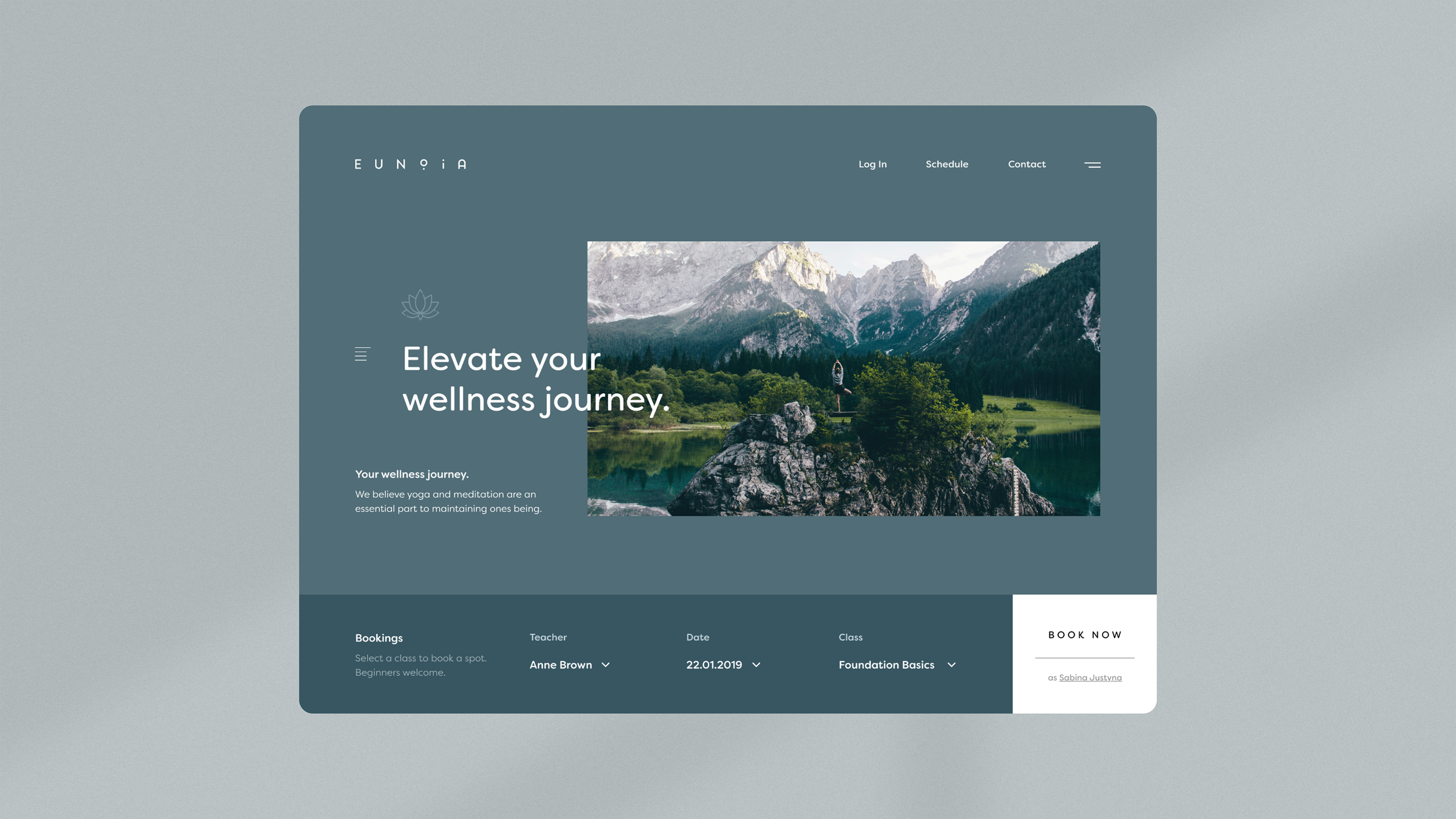
Modernizing the Lotus Emblem: Rather than using a generic or overly ornate flower illustration, I abstracted the lotus into a refined, minimalist geometric mark. The icon was crafted with balanced line weights and symmetry, transforming a traditional symbol into a contemporary, high end mark of quality.
Color Palette & Atmospheric Tone: We developed an understated, calming palette inspired by natural coastal elements, washed stone, and muted blues. The colours were selected specifically for their low visual friction, designed to feel restful both on screen and on physical collateral.
Typographic Balance & Layout Treatment: The minimalist lotus icon was paired with airy typography and generous negative space. Layout treatments were kept intentionally sparse to mirror the breath and pacing of a studio class.
THE IMPACT
The Eunoia concept demonstrates how thoughtful abstraction and intentional visual restraint can breathe fresh life into classic industry symbols. It stands as a comprehensive blueprint for how modern wellness brands can balance tradition with modern, editorial design.